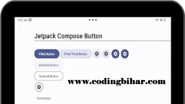
Jetpack Compose Button
List of six types of buttons with different appearance:
- Filled Button : This type of button has solid background with contrasting text.
- Filled Tonal Button : This button's background color varies to match the surface.
- Elevated Button : This type of button stands out by having a shadow that gives an elevated appearance.
- Outlined Button : This button has a border with no fill color.
- Text Button : This displays text with no background or border.
- Icon Button : This button contains an icon.
Some other types of buttons
Jetpack Compose Button Parameters
| Parameter | Type | Description |
|---|---|---|
onClick |
() -> Unit |
Defines the action to be performed when the button is clicked. |
modifier |
Modifier |
Used to modify the button’s size, padding, and other UI properties. |
enabled |
Boolean |
If false, the button will be disabled (grayed out and non-clickable). |
shape |
Shape |
Defines the shape of the button (e.g., rounded, circular, square). |
colors |
ButtonColors |
Sets the background, text color, and disabled state colors. |
border |
BorderStroke? |
Adds a border around the button with defined color and width. |
elevation |
ButtonElevation? |
Controls the button’s shadow (depth effect). |
contentPadding |
PaddingValues |
Sets the internal padding inside the button. |
interactionSource |
MutableInteractionSource |
Manages button interactions like ripple effects. |
- enabled: false/true to enable or disable on click method.
- shape: To change button defaults shape. eg. shape = RoundedCornerShape(10.dp) or shape = RectangleShape
- colors: It is used to change the default background color of the buttons.
- elevation: To create shadow effect below the button.
- border: Used to make a border for the buttons in outlined button
- contentPadding: For space between the container and the content
Code
@Composable
fun ComposeButton(modifier: PaddingValues) {
    Column(Modifier.padding(top = 60.dp, start = 80.dp)) {
 Text(text = "Customized Button", fontSize = 34.sp)
        Divider(
            Modifier
                .fillMaxWidth()
                .height(4.dp))
        Spacer(modifier = Modifier.height(40.dp))


Row (verticalAlignment = Alignment.CenterVertically){
    Button(onClick = {  }, shape = RectangleShape) {
        Text("Filled Button")
    }
    Spacer(modifier = Modifier.width(20.dp))
    Text(text = "Customized Button with rectangular shape")

}
        Row (verticalAlignment = Alignment.CenterVertically){
            Button(onClick = {  }, shape = RoundedCornerShape(10.dp)) {
                Text("Filled Button")
            }
            Spacer(modifier = Modifier.width(20.dp))
            Text(text = "Customized Button with rounded corner shape")

        }

        Row (verticalAlignment = Alignment.CenterVertically){
            Button(
                onClick = { },
                shape = RoundedCornerShape(topStart = 20.dp, bottomEnd = 20.dp),
                colors = ButtonDefaults.buttonColors(Color.Yellow),
                elevation = ButtonDefaults.buttonElevation(6.dp)

            ) {
                Text("Filled Button", color = Color.Black)
            }
            Spacer(modifier = Modifier.width(20.dp))
            Text(text = "Customized Button with rounded corner shape, button color,\n elevation and text color")

        }

    }
}
OUTPUT:
Buttons are essential interactive elements in any application. With Jetpack Compose, creating and customizing buttons is simple and intuitive. You can easily change their appearance and behavior to fit your app's design requirements.
In this lecture, we covered the basics of button creation, customization, handling clicks, and advanced button features like icons and disabled states. Experiment with these concepts to create engaging and responsive buttons for your apps.
Next, we’ll explore more UI components in Jetpack Compose, continuing to build a solid foundation for modern Android development. Stay tuned!


